Notable Project List
Design System
- Led the development of the Radiant Design System with an international team of designers, delivering over 80 components and 42,000 tokens across three continents.
- Achieved approximately 80% feature coverage, supporting over 2,300 monthly internal users.
- Increased design handoff efficiency by 56% and reduced feature time to market by 20%.
Accessibility
- Integrated accessibility into the Radiant Design System, making it the default standard.
- Reduced over 6,000 accessibility violations to fewer than 14 within 15 months.
- Incorporated AI into the accessibility testing process using Claude Code, Playwright, Axe, and Storybook.
- Complied with international standards including RGAA, ADA, WCAG, Section 508, CVAA, AODA, and Mandate 376, and maintained Accessibility Conformance Reports using the current VPAT template.
Making Accessibility the Default
A global procurement platform had more than 6,000 accessibility violations. The real problem was not the number. We had no way to stop making more.
The problem
GEP builds procurement software for some of the world’s largest companies. When I arrived, the platform carried more than 6,000 accessibility violations. Screen reader users could not complete core tasks. Keyboard users hit dead ends. The design team had no shared standard and no way to test their own work.
Clients had started asking hard questions. The answers were not good.
The team was working hard and still losing ground, because every new feature added new problems faster than anyone could fix the old ones.
Three teams. Three countries. No common toolset and no common language for what “accessible” even meant. You cannot test your way out of a hole like that. You have to change how the work gets made.
Building the testing practice
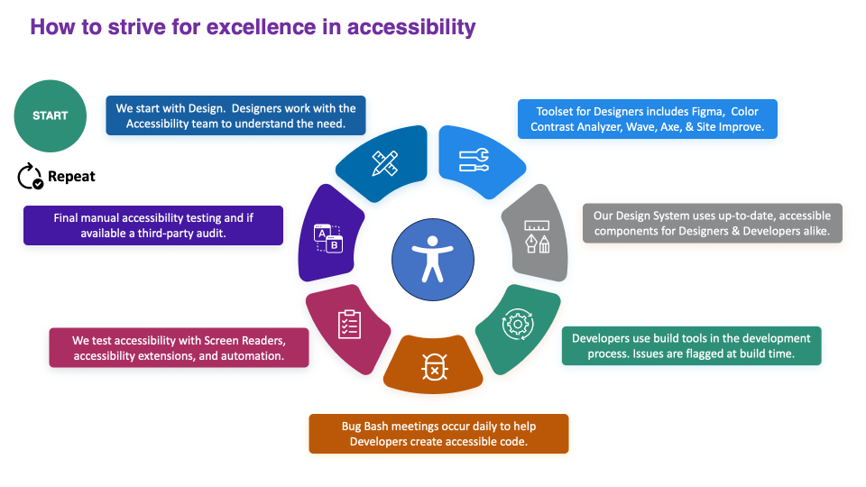
We trained first, fixed second. Every designer went through the W3C’s Digital Accessibility Foundations course, from the Web Accessibility Initiative and delivered through edX, before we touched the backlog. Not a lunch-and-learn. Real coursework, plus hands-on work with the tools they would use daily: Color Contrast Analyzer, WAVE, Axe, and SiteImprove.
We put the tools where the work happens. Designers verify contrast and structure in Figma before handoff. Developers have accessibility checks built into the build process, so problems get flagged before code ever merges. The style guide carries accessibility callouts on every component.
We hired testers with disabilities. This is the part I am most proud of. Our accessibility testers include people who use assistive technology every day. They test real scenarios with JAWS and NVDA, not simulations. A sighted developer running an automated scan will never find what they find.
We made fixing a daily habit. Bug Bash meetings happen every day, not as a quarterly cleanup. It keeps accessibility debt from piling up and teaches developers why each fix matters.
We brought in outside eyes. We partner with third-party auditors, including Level Access and Deque, to verify our compliance with ADA, WCAG, Section 508, CVAA, AODA, and Mandate 376. We keep our Accessibility Conformance Reports current against the latest VPAT template.
We built AI into the pipeline. I built an accessibility testing agent using Claude Code, Playwright, Axe, and Storybook. It checks components as they are built, so problems surface in minutes instead of quarters. The agent handles the repetitive scanning. The team handles the judgment calls.
The part most teams get wrong
Automation detects only about one-third of accessibility issues; the remainder require human evaluation. We could run Axe on every build and still ship a product that a blind user cannot navigate. The scan doesn’t know your tab order is illogical. It does not know that your error message is technically labeled but says nothing useful.
This is why we employ testers who use assistive technology and hold daily meetings. Tools provide efficiency, but people ensure accuracy. That is why we hired testers who live with these tools. That is why we meet daily. The tooling buys you speed. People buy you the truth.
Building the design system



Most of this work ran through the design system, because that is where you fix problems at the source instead of one screen at a time.
A complete navigation redesign. I led a full redesign of the platform’s navigation, the part of the product every single user touches. Getting navigation right is where accessibility and usability meet most visibly. A clear, logical, keyboard-friendly structure helps a screen reader user and a power user at the same time. We rebuilt it to be predictable, consistent, and usable by everyone.

The Radiant Design System. My team spearheaded Radiant, a system built so that accessibility was the default rather than a choice. Every component shipped with the right contrast, focus states, and semantics already baked in. Designers stopped deciding whether to be accessible. The system decided for them, and they built on top of it.
Rebuilding navigation with the team

Not long before I dug in, the platform had switched to a bento box menu, the kind of tiled grid that looks clean in a design review. In practice it hid everything. Users could not find the modules they needed to do their work. A tidy menu had quietly become a wall between people and their jobs.


This is where design sprints earned their keep.
I ran the team through Crazy 8s, a sprint method in which everyone sketches 8 ideas in 8 minutes. It sounds simple. It breaks the habit of settling for the first answer and gives everyone in the room an equal voice, since everyone sketches at once rather than letting the loudest idea win. We ran it right after talking to our customers, so the sketches were grounded in real frustration, not guesswork.
The sprints did something else too. They gave us a fast, visible way to build executive buy-in. When leadership can see eight directions on a wall and watch the team converge on one, the decision feels shared instead of imposed.
We landed on customizable navigation, filtered by whoever was signed in. Instead of one crowded menu that buried everyone’s tools equally, each person saw a path shaped around what they actually needed. The menu became a door again, not a wall.
Legible Procurement Data (Dashboards)
Procurement runs on data, and GEP’s users live in dashboards. Like every enterprise platform I have worked on, the product succeeds or fails on whether people can actually read what is in front of them.
We had a specific problem. Clients would open a dashboard and not know where to land. Every component carried the same visual weight, so nothing guided the eye. A screen full of equally loud elements is really a screen with no signal at all.
We ran a Crazy 8s sprint on this too. The goal was to rebuild the visual hierarchy so the most important information had the strongest presence on the screen, and the eye had a clear path to follow. Size, weight, contrast, and placement all became tools for telling users where to look first.


Then we went one step further. We built a section of the dashboard that could be swapped based on what a given user found most important. Not everyone comes to the same dashboard for the same reason, so instead of guessing at one perfect layout, we let the highest-priority slot adapt to the person using it.
That idea, letting the interface shape itself around the individual, is the same one behind the navigation work. Whether it was the menu or the dashboard, the answer to “everyone needs something different” was to stop forcing one fixed view on everyone.
Dashboards run through all my enterprise work. See the full story across GEP, HealthEquity, and Ivanti on the Dashboards page.
What I would tell another leader
Accessibility is not a testing problem. It is a design system problem, and a hiring problem, and a leadership problem.
You can hire an army of testers and file tickets forever. You will never catch up. The only way out is to make the accessible choice the easy choice, then make it the default. Build it into your system. Put people who use assistive technology on your team. Run the sprints. Change how the work gets made.
- 6,000-plus violations. Fewer than 14. 15 months.
- 80-plus accessible components shipped in the Radiant Design System.
- 20% faster time to market for features built on the system.
- Navigation everyone can use. Dashboards anyone can read.
- Accessible became the default, not a decision.
The 6,000 number is not the interesting part. The interesting part is that we stopped making new ones.
Accessibility is a global obligation
Software crosses borders, and so do accessibility laws.
I grew up in France, and I have spent my career watching accessibility get treated as a US checklist. It isn’t. A platform serving enterprise clients worldwide has users and legal duties well beyond the United States. My practice is built on WCAG 2.1 AA, the technical foundation that international frameworks extend. France’s RGAA turns those guidelines into concrete tests and a measurable compliance rate. The European Accessibility Act, in force since June 2025, now pushes those obligations onto private companies across the EU. These frameworks overlap, but they are not the same, and treating them as interchangeable is a common and costly mistake.
That is not an academic distinction to me. It is a commitment to reaching every user, wherever they are.