The impact that I bring to an Organization
Good design starts with listening, then hides the hard parts so the person in front of the screen only sees the next choice they need to make. Here is what that has meant for three organizations at scale. For 25 years, I have done that at scale — for health savings tools used by millions, enterprise software used in thousands of companies, and apps built for families in hard moments.
Below is the impact Ihave delivered to three organizations. Each summary opens into the full story.
Enterprise SaaS · Head of Accessibility & Design Systems
GEP

Making accessibility the default
From 6,000-plus to fewer than 14 violations in 18 months ·
80+ accessible components · 20% faster to market
A global procurement platform carrying deep accessibility debt. I trained the team, built accessibility into the design system so the accessible choice became the default, and stood up an AI-assisted testing pipeline. The result was not just a cleaner product. It was a team that stopped creating the problem.
Healthcare and Fintech · Director of User Experience
HealthEquity

Two products, one experience
The nation’s largest HSA custodian, merging with the largest FSA provider. I helped rebuild the Tyrian Design System to serve both individual members and enterprise clients, redesigned the most important features, and built the collaboration systems that let design ship. The mobile app went from an afterthought to a point of pride.
2.5 → 4.4★ mobile rating · 12M+ merged accounts unified · WCAG compliance for the biggest insurers
Enterprise IT · UX Principal Architect & Manager
Ivanti

Earning UX a seat at the table
A team whose recommendations kept getting overruled. I co-led an international UX guild, brought real user research into the process, and shipped self-service procurement and voice-driven prototypes years ahead of their time. The work changed how the organization valued design.
NPS +18% after user-centric design · 50+ field interviews · 6 products led
Every good project should start with research. This is a time-lapse of my team building an affinity map shortly after conducting 50+ interviews at the Ivanti user conference.
Planning out through diagrams, cartoons, and affinities. Have you ever read XKCD? Quite a successful cartoon, mainly because the content and context are compelling. The cartoons you put together don’t need to be picture perfect, but the story they tell needs to ring true. This applies to personas, user journeys, and feature stories as well.


Kinware
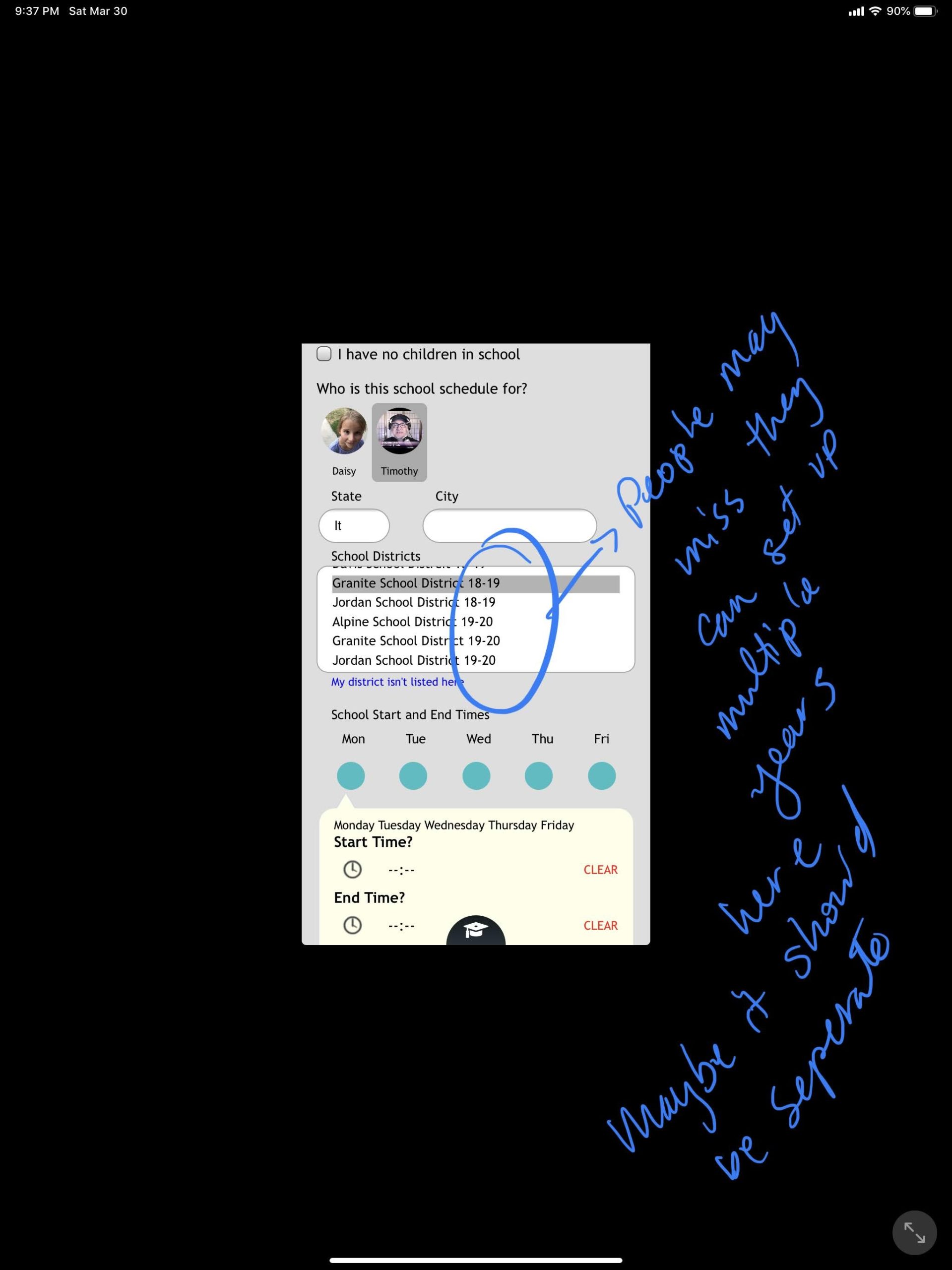
An app created to help divorced families schedule time with the least amount of friction possible.


A quick movie showing the interaction of a chat bot we were working on for Ivanit.


ZXcZXc